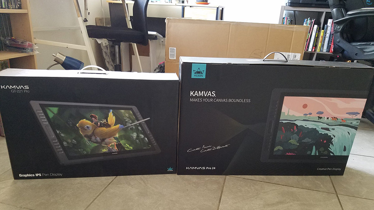
I started seriously getting into digital art and tablet displays a few years ago while in college. Although I’d owned a Wacom Bamboo and Intuos Pro 4 previously, I was never able to truly overcome the disconnect between looking at a screen while drawing on my lap. Everything changed for me in 2016 when I bought a Wacom Mobile Studio Pro. I’m sure it’s true for the individual artists who say that drawing on a tablet display isn’t any different than drawing on a cheap digitizer, but it was night and day for me and I’m willing to bet that’s true for others as well. Since then I’ve added a Huion GT-221 Pro and Microsoft Surface Pro 6 to my drawing arsenal. Last month I decided to upgrade my Huion to the new 2020 Kamvas Pro 24, which is what I’ll be reviewing today.
Initial Impressions

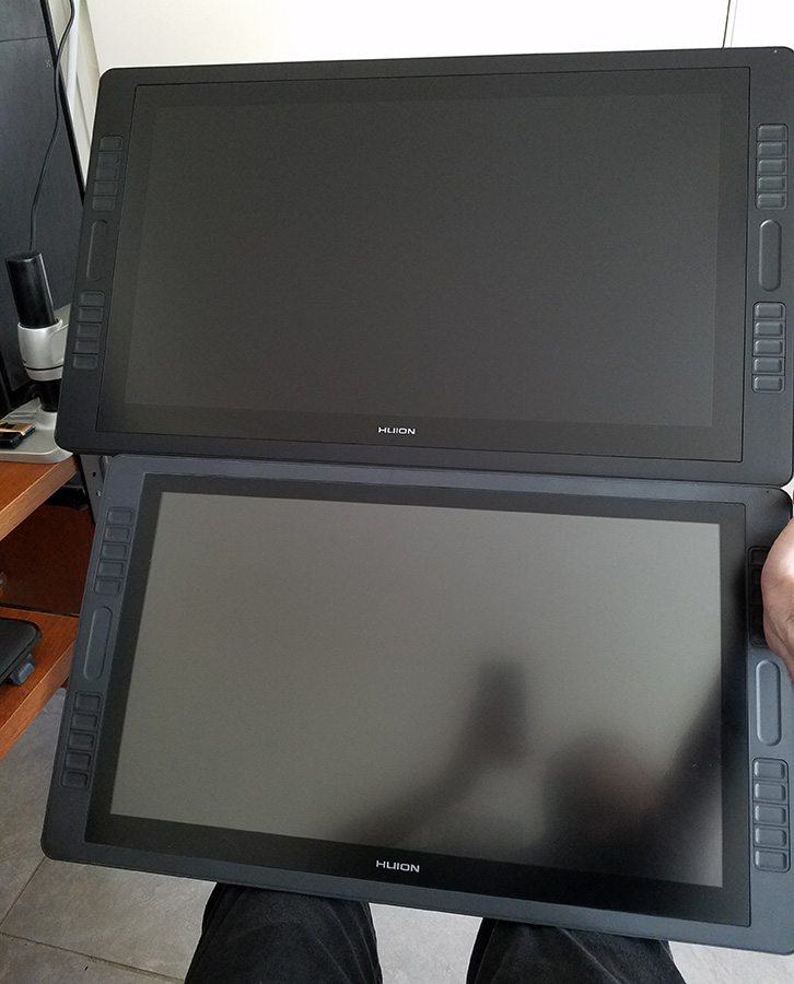
Opening the box, the packaging felt very similar to my old Kamvas GT-221 Pro, although this time there weren’t panels of masonite helping protect the tablet. Still, everything inside was fine despite the obvious knocking around it received in transit. Out of the box, the Pro 24 looks exactly like a scaled-up version of the 221. I’ve always liked the minimalist look of the 221, so I’m not sad that they didn’t feel the need to make any drastic changes there.
The Screen
Physically, this thing FEELS big, and 2 more diagonal inches is nothing to sneeze at. But the real size improvement is with the resolution. The 221 only offered 1080p, which made swapping windows back and forth to my QHD monitor a little obnoxious. Also, the nature of a drawing tablet is that you’re working with it much closer than you would an ordinary monitor, so those pixels really made themselves visible. The Pro 24 has QHD 2560 x 1440p resolution, which works better for working up close.
I was never able to get very accurate colors out of the 221. Everything skewed green and slightly desaturated no matter how I tried to adjust the settings, so I’d often have to drag my finished artwork over to my other monitor and adjust colors in post. I’m super fuzzy on the differences between color gamuts, but the 221 used a 72% NTSC colorspace, while the Pro 24 has switched to 120% sRGB. The color accuracy and display range on my Huion is now (theoretically) superior to that of my regular desktop monitor, so I don’t need to do as much window shuffling. The display is an IPS panel, offering super wide viewing angles so colors remain accurate no matter how the screen is tilted. It should be noted that I haven’t done any professional printing of projects from this tablet yet, so all of my comparisons have been between various devices. Also, I am a layman lacking professional color testing or calibrating equipment.

Just like the Kamvas GT-221 Pro, the glass is lightly etched. This gives the surface a matte appearance, helping reduce glare and – most importantly- creating an enjoyable surface to draw on. It’s real glass too, which will keep its texture longer than the textured plastic layer that many other budget tablets utilize. This gets reflected in the asking price, but even at $900, the 24 Pro is less than half of what you’d pay for a comprable Wacom.
One of the most common complaints about the 221 was regarding parallax, or the distance between pen tip and onscreen cursor. There was a very obvious gap, which I mostly compensated for by paying attention to the cursor rather than the pen. Lamination fixes the issue by physcially adhering the glass to the display, so the only gap is the thickness of the glass itself. With the 221, accuracy and parallax got exponentially worse near the corners and edges of the screen, making it hard to click things in the corner (like the x to close a window). The driver for the Pro 24 seems to overcompensate for this old issue, throwing the cursor nearly off the screen once you get within an eighth of an inch of the corners. The rest of the screen seems perfectly accurate, so I have to wonder if this compensation was even necessary. Parallax isn’t totally eliminated with the Pro 24, but it is considerably better than the 221, and well within expected and acceptable limits especially at this price point.
The Pen

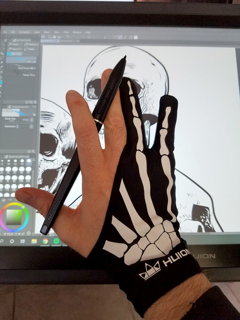
Another big leap for Huion is moving to a battery-free stylus. I was never bothered by having to recharge the old pens; the battery lasted a very long time and I could use the pen while it was plugged in. But it’s hard to deny that going battery-free feels a little luxurious. The new stylus offers the same 8192 levels of pressure sensitivity that the old pens had, but the PW 507 supports up to 60 degrees of tilt. It’s not a feature I consciously use much, but I did experiment with a few tilt-specific brushes and can confirm that it at least works. The programmable 2-button rocker on the stylus will be familiar to anyone who’s used Huion or Wacom’s previous pens. The one thing missing that would’ve made this feel premium for me would’ve been the addition of an eraser like the Wacom or Surface Pro styluses. But it’s hardly a dealbreaker and this is a “budget” tablet.
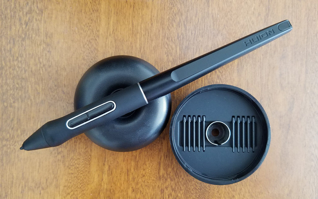
The pen comes with a donut stand that holds the pen horizontally or vertically. Inside, there are 10 extra nibs and a nib remover. Huion doesn’t include any fancy felt or rubber nibs; they’re all the same hard plastic. Huion’s stock nibs feel great on the etched glass and I’ve never felt like I needed other options (unlike on my Surface Pro – but more on that in a future post). I don’t really use the donut to hold the pen and I actually miss the hole in the back of the 221 that held the stylus right there on the tablet. But that’s a minor gripe and entirely subjective.
Express Keys
The Kamvas 221-GT Pro had 20 buttons but they were mirrored, meaning only 10 discreet functions. Huion took the obvious next step with the Pro 24, and now each hotkey is individually programmable, making for 20 available shortcuts right there on the device. I never used the shortcut buttons on my 221, preferring to keep one hand on my keyboard. I may have to teach myself some new habits, however, as the 24 is big enough to make it uncomfortable to reach under. The touch strips are the same as the 221, again mirrored on both sides to accommodate left or right-handed users.
Other Considerations
The stand looks like it might be the exact same one that came with the 221. I liked that stand for its stability, versatility, and ease of use. I’ve since upgraded to an off-brand Ergotron arm, so I didn’t even bother with the stand on the Pro 24. I have seen in other reviews that some of the available angles lift this larger tablet’s feet off the table, making it wobbly to work on.
I’ve also seen other reviews complain about build quality. The express keys are a little wobbly compared to the 221, sure. Tactile feedback isn’t as nice as my Wacom Mobile Studio Pro. Otherwise this feels like a solid, quality tool worthy of its asking price. Huion is head of the pack when it comes to Wacom’s competition and they keep getting better.
Overall

The higher resolution and wider color gamut alone made the upgrade justifiable to me. The extra size, customizability, tilt support, and battery-free pen are all just icing on the cake. Performance on this has been exemplary, although I should add that it seemed to need a warm up period for the first day or so before it started behaving. The Pro 24 absolutely feels like a professional tool and not a toy (although it’s still fun to use). If you’re considering upgrading from an older tablet or buying your first, you could do much worse than the Huion Kamvas Pro 24.
Hey!
Thank you for the excellent review, it covered a lot of topics that i was unsure about. And since you have a wacom mobile studio too, it was nice to know you had some product from the competition as referance.
I have been looking to upgrade from my wacom cintiq 16 (non pro), since its a little small and the colours are worse than i would have expected. Also the 1080p screen was a downgrade for me, since before that i used a 1440p screen and an intuos for working, This seems like a great upgrade for me 🙂
Thank you!
I’m so glad my review was helpful! After months of using it, I’m still a fan. Speaking of colors, have you seen Huion’s new 16″ 4k tablet monitor? Marc Brunet has a good review up on his YouTube. I’m happy with the Pro 24 because the resolution matches my other monitor and I’m a big fan of the size, but the 4k seems like the place where Huion finally catches up with Wacom, and at a reasonable price point. Let me know what you end up getting and how you like it!